Voter Resource Prioritization Toolkit

Why We Built this Toolkit

With the election coming up in November and the COVID-19 pandemic causing disruptions, many groups and commmunities are increasing their focus on vote-by-mail options. While that increased focus is justified, that action alone is insufficient to protect the right to vote in the 2020 elections. Failure to ensure safe, accessible in-person voting risks further disenfranchising many Americans, especially those in marginalized groups. We believe that the expansion of voting by mail must be coupled with resources to address local operational gaps that will make voting in person increasingly difficult.

Due in large part to COVID 19, our election system is facing a critical shortage of poll workers to staff the polls in 2020. Recruiting poll workers, who work to ensure the in-person voting process operates safely and efficiently, is challenging even in normal times. Today, COVID-19 has exacerbated the difficulties typically associated with poll worker recruitment: a large proportion of poll workers tend to be senior citizens, a vulnerable population during this pandemic that will, with good reason, likely refrain from working the polls in November.

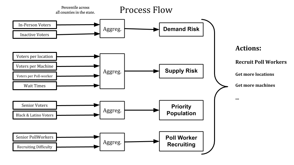
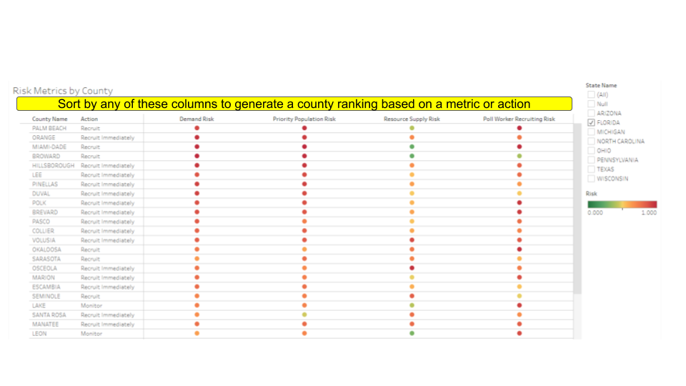
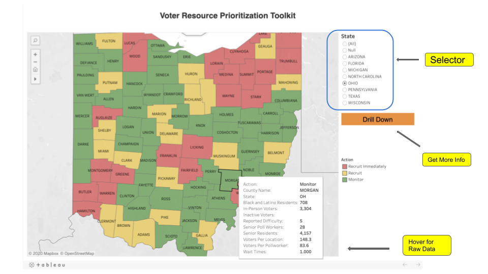
To address this issue, Carnegie Mellon University, in collaboration with the Voter Protection Corps, developed a “voting risk assessment” tool by collecting and analyzing public data to determine which counties in eight key states (Arizona, Florida, Michigan, North Carolina, Ohio, Pennsylvania, Texas, and Wisconsin) will need the most support in recruiting poll workers to ensure the right to vote. Though thorough poll worker recruitment will require a large-scale intervention from many organizations and governments across the country in this election, our tool analysis enables organizations to understand:

  • Demand (for In-Person Voting Resources): How many voters will be impacted by same-day in-person voting issues in each county?
  • Supply (of In-Person Voting Resources) : What types of resource constraints and challenges exist related to in-person voting including locations, machines, and poll workers?
  • Poll Worker Recruiting Difficulty: What challenges have counties faced in the past as they recruited poll workers?
  • Priority Population: What is the extent to which vulnerable populations are going to be affected by these voting barriers?
We used the indicators listed above to identify counties with gaps that make them high-priority targets for immediate poll worker recruiting efforts. While our tool uses existing data and focuses on certain types of voting risks, it is flexible enough to incorporate additional data generated by campaigns and voter outreach groups as they launch voter registration, GOTV, and poll worker recruiting efforts and inform various voter protection efforts including poll worker recruiting, getting additional polling locations and machines. Equipped with this understanding, voter protection organizations can allocate their resources efficiently, create a call to action, and ultimately provide targeted support in their priority counties.

How To Use it

What is "The Toolkit"?

This toolkit is a collection of interactive graphs and lists that highlight gaps in voter resources within states.

What data does it use?

Most data comes from the Election Administration Voter Survey Instrument, the American Community Surveys, and the Cooperative Congressional Election Survey from 2016 and 2018. This data includes four broad metrics used to ascertain risk:
  • In-Person Demand for Voting Resources
  • Supply of Voting Resources
  • Priority Populations (e.g. vulnerable due to COVID-19 or historical reasons)
  • Poll Worker Recruiting Difficulty

What’s the purpose?

No two counties are alike. This toolkit exists to understand each county’s unique voter characteristics, resources, and gaps. Voter protection organizations can then use this information to more effectively allocate resources and target areas for support or additional interventions.

What are these actions I’m seeing?

This version of the toolkit was designed in partnership with the Voter Protection Corp to identify high urgency counties for poll worker recruitment. (Because few poll workers → long wait times → suppressive effects). Before doing any analysis, we needed to understand the intervention space: What are all possible actions? For the poll worker recruiting project, the actions were:
  • Recruit Immediately
  • Recruit
  • Monitor

How did you designate these actions?

Each county received four sub scores in our risk metrics above. Based on each county’s unique performance on these scores (high, medium, or low), we mapped a direct action using a decision matrix offered by the Voter Protection Corp.

What if my organization’s actions are different?

Perfect! This tool is open source, indicating that it can be downloaded, updated, and expanded. If the indicators we have works for you, you can download the data, update the decision matrix with your actions and interventions, and then see your new results. You can also expand these categories with data that’s important to you. The goal of this tool is to be as interactive and customizable as possible.

What’s included?

The current version of the toolkit includes five separate views of our data. These are broken down further below.
  • Direct Action Map: View the recommended actions for each county based on the data
  • County Metrics: See how each county ranks in percentiles; visualize trends and gaps
  • County Indicators: Drill down to see which indicators drive the overall risk metric score
  • Risk Metrics Heat Map: View and sort county rankings based on a single metric
  • Risk Indicator Heat Map: View and sort county rankings based on all available data

What do each of these pages show?

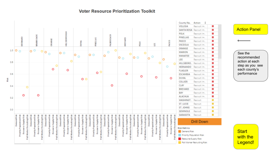
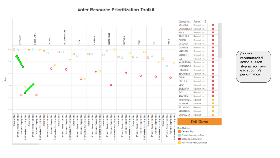
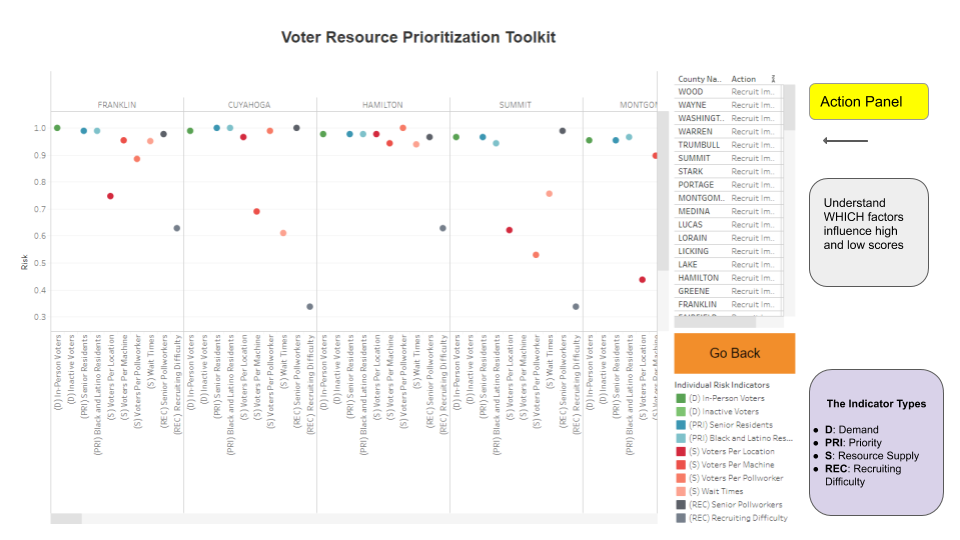
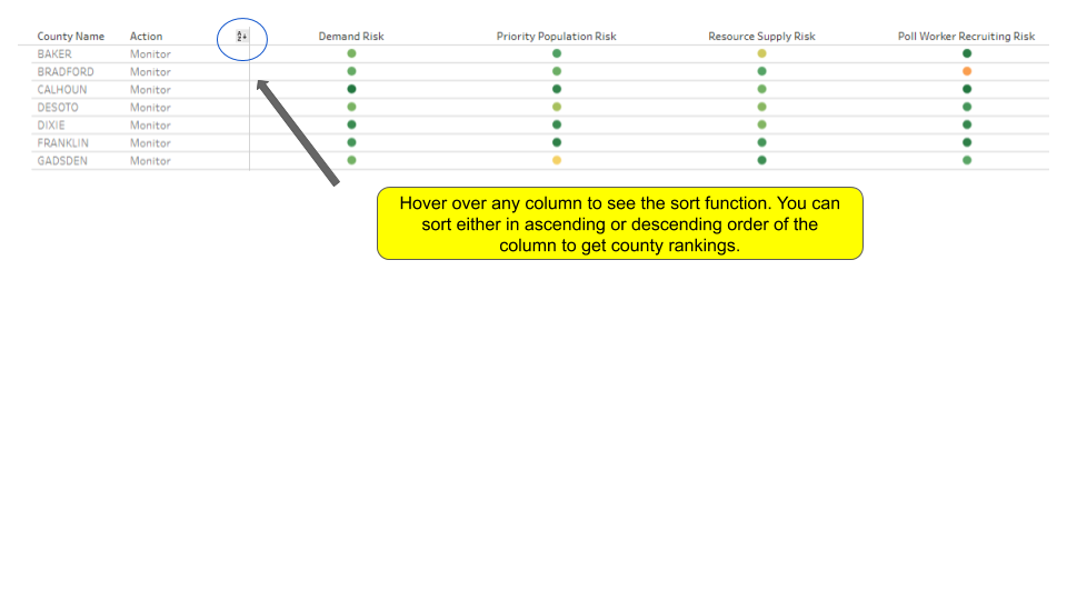
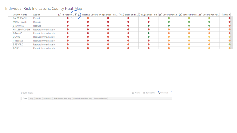
We provide a detailed explanation for each of the views included in the toolkit here: User Guide. Additionally, we provide some screenshots of how each of the pages look below. A detailed explanation of how this toolkit is provided in the detailed report.

Screenshots

Figure 1: Overall Process Flow
Figure 2: County-Level Performance
Figure 3: Click to analyze aggregated data
Figure 4: Understand various factors
Figure 5: Sort by columns to generate customized ranking
Figure 6: Sort to get county rankings
Figure 7: Customized Rankings and Recommended Actions, ready to download
Figure 8: County-Level Map

Video

How We Built it

Data Sources

Data Source Description Year Data
Election Administration and Voting Survey (EAVS) Provides county-level election data about the resources, local characteristics, and infrastructure for U.S. elections. 2016 Link
The Cooperative Congressional Election Study (CCES) Provides information about political attitudes and voter election experience 2016 Link
American Community Surveys (ACS) Provides community characteristics of U.S. residents. 2018 Link

Analysis

Creating the Tool: An Action-Focused Approach All steps of the current analysis lead to a direct action for each county based on that county’s unique voter characteristics. We considered three immediate actions to be used to guide poll worker recruitment in each county: Recruit Immediately, Recruit, Monitor. With these actions in mind, we aggregated data in a way that can qualify voter resources in each county to address potential gaps in poll worker needs. While poll worker recruitment will be essential for nearly every county in the upcoming general election, decision makers with finite resources must prioritize first where to take action.

The Indicators: Voter Data Across Four Key Metrics We selected risk indicators based on qualitative means (research and domain experience), technical means (analysis of correlation and regression models), and data availability (access and completion). We organized the risk indicators into four overarching metrics that address a unique attribute of the voter resources.

Metric Indicator Definition (County Level) Data Sources
Demand Risk In-Person Voters Number of persons who vote in-person EAVS
Inactive Voters Number of inactive voters (who would need to go in person to reactivate their registration) EAVS
Resource Supply Risk Voters per Location Number of voters per polling location EAVS
Voters per Machine Number of voters per voting machine EAVS
Voters per Poll-worker Number of voters assigned per poll-worker EAVS
Wait Times Time waited to cast the vote CCES Survey Data
Priority Population Risk Black and Latino Population Number of Black and Latino voters Census
Senior Citizens Number of senior citizen voters (60+) Census
Poll Worker Recruiting Risk Recruiting Difficulty Difficulty in Recruiting (1 to 5) EAVS
Senior Poll Workers Number of Poll-workers who were seniors (60+) EAVS

Output

How We Scored? For each indicator, all counties were ranked in comparison to their peers using percentiles. For the key risk metrics, we explored several aggregation techniques (e.g. rule-based, median, min, and max) to combine inputs into a single score. Based on correlation of values, median is used for toolkit display purposes. These scores were then designated as “high”, “medium” and “low” based on the top, medium, and bottom quartiles, respectively.

What does this tool enable? While created specifically to aid in the targeting of poll worker recruitment, we designed the voter risk assessment tool to host a flexible, interactive, and transparent view of U.S. voter data. This view enables several possible actions to improve the voter experience based on tailored information on a county’s existing voter resources. We hope this enables further voter protection work in the upcoming election.

Some Insights from Analysis In general, larger population centers scored higher on demand and priority population risk. This is intuitive, since these metrics relate closely to raw numbers of voters. Yet, for many counties, high demand risk did not necessarily indicate high supply and recruiting risk. Of all counties with high demand risk, only 21% also had a high supply risk. For these high demand and high supply counties, however, this indicates a potentially large negative impact on a large number of voters. The analysis demonstrates the importance of allocating resources based on a tailored view of each county’s unique voter characteristics.

The Team

Kaila Gilbert
Carnegie Mellon University

Hemank Lamba
Carnegie Mellon University

Jessica Toth
Carnegie Mellon University

Bob LaRocca
Voter Protection Corps

Rayid Ghani
Carnegie Mellon University

Quentin Palfrey
Voter Protection Corps

Contact

dssg+voterprotection@cmu.edu